
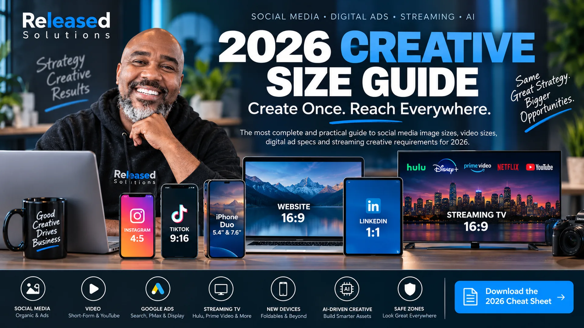

2026 Social Media, Digital Ad and Streaming Creative Size Guide
In 2018, a social media image-size guide could mostly be a chart: Facebook cover photo, Twitter header, Instagram square, LinkedIn banner. That world is gone.
In 2026, the same campaign may appear in a mobile feed, vertical short-form video, search ad, AI-assembled Performance Max placement, laptop browser, foldable phone, streaming television, or connected-TV interface. The creative may be cropped, recombined, overlaid with controls, or adapted to a screen the designer never saw.
That means the modern question is no longer, "What size should this image be?" The better question is:
Stop designing one image for one placement. Build a creative system that can survive multiple screens, crops, orientations, and ad formats.
The Four-Master Creative System
Instead of creating dozens of disconnected files, start with four master compositions. They are starting canvases, not permission to stretch or blindly crop one design into every other format.
Landscape (16:9 / 1.91:1)
Working sizes: 1920 x 1080 for video, 1200 x 628 for images.
Best for: web, YouTube, connected TV, streaming, display, horizontal ad units.
Square (1:1)
Working size: 1200 x 1200.
Best for: feeds, Google search image assets, LinkedIn, Performance Max, and other flexible cross-platform distribution.
Portrait (4:5)
Working size: 1080 x 1350 (or platform equivalent).
Best for: mobile feeds and vertical placements that stop short of full-screen framing.
Full-Screen Vertical (9:16)
Working size: 1080 x 1920.
Best for: Reels, Stories, TikTok, Shorts, and any full-screen vertical video placement.
| Master | Ratio | Working size | Best use |
|---|---|---|---|
| Landscape | 16:9 / 1.91:1 | 1920 x 1080 (video) / 1200 x 628 (image) | Web, YouTube, CTV, streaming, display, horizontal ads |
| Square | 1:1 | 1200 x 1200 | Feeds, Google assets, LinkedIn, flexible social |
| Portrait | 4:5 | 1080 x 1350 (or platform equivalent) | Mobile feeds and vertical placements without full-screen framing |
| Full-screen | 9:16 | 1080 x 1920 | Reels, Stories, TikTok, Shorts, vertical video |
Recompose each master. Move the subject, headline, CTA, and supporting elements so the design works naturally in that shape. Auto-crop is not a substitute for composition.
Pixels Tell You the Canvas. Safe Zones Tell You Where the Message Can Live.
A file can meet the required pixel dimensions and still fail visually. Platform controls, captions, profile elements, ad labels, countdowns, buttons, and automatic crops can cover the edges of the creative.
Google recommends keeping important image content within the center 80 percent for Search image assets and Performance Max. Prime Video and other connected-TV interfaces also publish placement-specific safe zones because UI can cover portions of the frame.
Keep logos, faces, product details, prices, and primary CTAs away from vulnerable edges unless the placement-specific template says otherwise.
Canvas size is the technical requirement. Safe-zone discipline is the creative requirement. Neither replaces the other.
Why Device Size Is No Longer the Right Question
A customer can now encounter the same campaign on a conventional phone, foldable phone, tablet, laptop, desktop monitor, or television.
Apple introduced iPhone Duo in September 2026 with a 5.4-inch outer display and a 7.6-inch inner display. Apple says both displays share the same aspect ratio so content scales proportionally, while iOS adapts as the device folds, rotates, and switches displays.
That is a useful reminder: design for adaptive display rather than a specific handset. New hardware will keep arriving.
Adaptive Devices
Foldables, dual displays, tablets in landscape, and living-room TVs each render the same file differently. Assume the design will be scaled, cropped, and rotated. Aim for a composition that stays readable in every one of those forms.
AI-Assembled Ads
Performance Max, Advantage+, and other AI-driven products assemble the final ad from your asset library. Provide clean images, logos, headlines, and CTAs. The platform picks the combination, and you cannot always control which one it serves.
Safe-Zone Discipline
Interface overlays, ad labels, captions, and CTV UI eat into the frame. Center-80 for Google search image assets. Placement-specific templates for Prime Video and CTV. Treat edges as vulnerable by default.
Google Ads: Build Asset Families, Not Finished Posters
Google Ads is one of the clearest examples of why creative production has changed. Performance Max uses groups of text, image, logo, and video assets across Google inventory. The platform can assemble those assets in different combinations. See more on this in digital marketing and paid advertising.
| Placement | Ratio | Recommended | Minimum | 2026 note |
|---|---|---|---|---|
| Search image assets | 1:1 | 1200 x 1200 | 300 x 300 | Square required |
| Search image assets | 1.91:1 | 1200 x 628 | 600 x 314 | Landscape recommended |
| Performance Max | 1:1 | 1200 x 1200 | 300 x 300 | Required |
| Performance Max | 1.91:1 | 1200 x 628 | 600 x 314 | Required |
| Performance Max | 4:5 | 960 x 1200 | 480 x 600 | Recommended |
| Performance Max square logo | 1:1 | 1200 x 1200 | 128 x 128 | Required |
| Performance Max horizontal logo | 4:1 | 1200 x 300 | 512 x 128 | Recommended |
Google allows up to 20 images in a Performance Max asset group and recommends multiple unique landscape, square, and portrait assets. Its documentation also recommends at least one version without text or graphic overlays for each major aspect ratio.
Search image assets use the same core square and landscape dimensions, and Google explicitly notes that advertisers cannot control which eligible image format serves in each auction. This is why a clean asset library matters more than one heavily designed ad.
LinkedIn: Professional Feeds Still Need Multiple Compositions
LinkedIn single-image ads currently support horizontal, square, and vertical creative. Square is a strong cross-device default. Vertical creative is mobile-only, and LinkedIn recommends 4:5 to avoid borders.
| Format | Ratio | Recommended size | Delivery note |
|---|---|---|---|
| Single image | 1.91:1 | 1200 x 628 | Desktop + mobile |
| Single image | 1:1 | 1200 x 1200 | Desktop + mobile |
| Single image | 4:5 | 720 x 900 | Recommended vertical mobile composition |
| Single image | 2:3 | 600 x 900 | Supported vertical |
| Single image | 1:1.91 | 628 x 1200 | Supported vertical |
X: The Format Range Is Wider Than the Old Twitter Era
The platform now supports a broader range of image and video ratios than the 2018 Twitter-era guidance. That makes a multi-master workflow more useful than a single recommended image size.
| Format | Ratio | Recommended size |
|---|---|---|
| Standalone image | 1:1 | 1200 x 1200 |
| Standalone image | 1.91:1 | 1200 x 628 |
| Expanded | 4:5 | 1440 x 1800 |
| Expanded | 2:3 | 1080 x 1620 |
| Expanded | 16:9 | 1920 x 1080 |
| Expanded | 9:16 | 1080 x 1920 |
| Standalone video | 1:1 | 1200 x 1200 |
| Standalone video | 16:9 | 1920 x 1080 |
Short-Form Video: Design for the Phone in the Hand
Vertical 9:16 remains the working master for full-screen short-form video such as Reels, Stories, TikTok, and Shorts. But the export dimensions are only part of the job.
Keep captions readable, leave breathing room around interface controls, make the opening frames understandable without audio, and do not place the only CTA at the extreme bottom of the frame.
When a platform supports both square and vertical video, build the vertical story first if the placement is truly mobile-first, then create a deliberate square or landscape alternative rather than auto-cropping.
YouTube: One Platform, Several Viewing Environments
YouTube content can be watched on phones, computers, and televisions. Channel art and video playback behave differently across devices.
For video production, 1920 x 1080 remains a practical 16:9 HD master. For Shorts and other vertical-first creative, 1080 x 1920 is a practical 9:16 working master. Always verify the specific YouTube product or ad format before trafficking a campaign.
Multi-Master First
Landscape, square, portrait, full-screen vertical. Recompose per shape, do not auto-crop.
Safe Zones
Center 80 percent for Google. Placement templates for CTV. Treat edges as vulnerable by default.
Asset Systems
Feed the platform clean images, logos, headlines, and CTAs. Let it assemble.
Verify Before Launch
Specs change. Always check the current ad product documentation immediately before trafficking.
Connected TV and Streaming: Your Social Ad Is Not a TV Commercial
Streaming inventory deserves its own production workflow. A vertical social video cannot simply be uploaded everywhere.
| Platform / format | Ratio | Current technical size | Creative implication |
|---|---|---|---|
| Disney / Hulu video commercial | 16:9 | 1920 x 1080 preferred; 1280 x 720 accepted | 1:1 and 9:16 rejected for this format |
| Amazon Streaming TV / Prime Video | 16:9 | 1920 x 1080 minimum | Full-screen streaming TV |
| Prime Video Pause Ad background | 16:9 | 1920 x 1080 minimum; 3840 x 2160 recommended | UI-aware composition required |
Disney Advertising currently requires 16:9 for its standard video commercial product, prefers 1920 x 1080, and rejects 1:1 or 9:16 for that format.
Amazon Streaming TV and Prime Video require 16:9 with a minimum 1920 x 1080 frame size. Amazon's Prime Video products also publish UI-specific safe-zone guidance for placements such as feature rotators and pause ads.
CTV creative should be reviewed from television viewing distance. Text that looks large on a laptop may be unreadable across a living room.
AI-Driven Advertising Changes What "the Ad" Means
Increasingly, the advertiser supplies an asset library and the platform helps determine the final combination. Google uses machine learning across responsive and Performance Max advertising, and even provides AI-assisted image upscaling for some campaign types.
That shifts creative production from one finished poster toward modular components: product images, lifestyle images, logos, headlines, descriptions, videos, CTAs, and landing pages.
Each component should make sense on its own and remain on-brand when combined with other approved components.
Images + video + logos + headlines + descriptions + product visuals + audio + CTAs + landing pages.
2026 Digital Creative Size & Safe Zone Cheat Sheet
The full spec tables + safe-zone reminders in one printable PDF. Free download, no form.
What About Meta, Instagram, TikTok, Pinterest, Snapchat, and Emerging Platforms?
These platforms remain essential to a complete creative workflow, but their product-level specifications change frequently and can vary by placement, objective, and ad type.
For production, keep the four masters ready: landscape, square, portrait, and full-screen vertical. Then verify the exact placement requirements in the platform's current business or ads documentation immediately before launch.
This guide intentionally separates durable creative strategy from volatile product-level specifications.
Image File Formats and Compression
JPG. Best for photographic imagery when transparency is not required. Export at a quality level that preserves detail without creating unnecessarily large files.
PNG. Useful for logos, interface-style graphics, and images requiring transparency. Platform limits vary.
WebP. Excellent for website delivery because it can provide strong visual quality at smaller file sizes. Do not assume every ad platform accepts WebP uploads. Convert to the platform's accepted format when trafficking.
Source files. Keep layered or editable masters. The delivery file is not the archive.
Video Production Basics
Resolution. 1080p remains a practical baseline for many social and streaming workflows, but some placements require or benefit from higher-resolution source files.
Frame rate. Preserve the native frame rate unless the destination requires something different. Do not create artificial smoothness by blindly upsampling.
Audio. Mix for the destination. Streaming-TV specifications can include bitrate, sample-rate, and loudness requirements that are much more specific than social uploads.
Captions. Design for silent viewing where appropriate and provide captions when the platform or audience benefits from them.
Compression. Keep a high-quality master and create delivery exports for each destination. Repeatedly recompressing the same file degrades quality.
Accessibility Is Part of Creative Quality
Readable text, sufficient contrast, captions, clear visual hierarchy, and meaningful alternative text on web content are not optional polish. They affect whether people can understand the message.
CTV is a good reminder that viewing distance matters. Mobile is a reminder that interface overlays matter. Accessibility and safe-zone thinking often improve creative for everyone.
Build a Reusable Creative Asset Library
Brand foundations. Square logo, horizontal logo, color palette, type system, approved CTA language, and legal/disclosure elements.
Image families. Product-only, lifestyle, people, environment, detail, and background images with clean versions that do not rely on baked-in text.
Video families. 16:9, 1:1 or 4:5 where needed, and 9:16 masters with captions and platform-safe variants.
Copy modules. Short and long headlines, descriptions, offer language, and CTA options.
Measurement. Consistent naming, campaign IDs, UTMs, and landing-page destinations so creative performance can be analyzed. A good online presence management system keeps this repeatable.
The 2026 Master Cheat Sheet
| Need | Start with | Why |
|---|---|---|
| Horizontal web/video/CTV | 1920 x 1080, 16:9 | Strong video and streaming master |
| Horizontal ad image | 1200 x 628, 1.91:1 | Common Google and LinkedIn landscape asset |
| Square | 1200 x 1200, 1:1 | Flexible feed and ad asset |
| Portrait feed | 1080 x 1350, 4:5 | More mobile screen space |
| Full-screen vertical | 1080 x 1920, 9:16 | Short-form and story-style placements |
| Google PMax portrait | 960 x 1200, 4:5 | Google's recommended portrait size |
| CTV commercial | 1920 x 1080, 16:9 | Current baseline for major streaming ad products |
Platform specifications can change. Verify the exact ad product immediately before upload. This page shows a Last Verified date and is reviewed regularly.
Last Verified: September 2026
Platform sizes change. This page and the downloadable cheat sheet are reviewed at least twice a year, and every table shows the last verification date next to it. If you are about to launch a campaign, always reverify the ad product's current spec before trafficking.
How Released Solutions Uses This Guide
The goal is not to create more resized graphics. It is to create a repeatable system that lets a business show up consistently across websites, social media, search advertising, video, streaming, and whatever screen comes next.
A strong creative system reduces production waste, protects brand consistency, and gives advertising platforms better source material to work with.
2026 Digital Creative Size & Safe Zone Cheat Sheet
The full spec tables + safe-zone reminders in one printable PDF. Free download, no form.
Need a Creative System That Can Move Across Channels?
Released Solutions helps businesses connect creative, websites, social media, paid advertising, video, analytics, and AI-assisted workflows around measurable business goals.
If your creative production has become a stack of one-off files, we can help build the asset library and the process behind it.
Build the asset system once. Ship it everywhere.
Last verified: September 2026
Kenneth Durrum, Released Solutions