
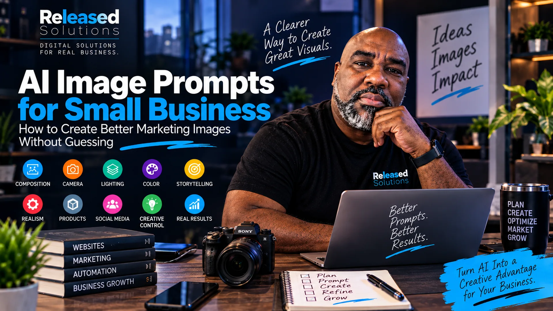

AI Image Prompts for Small Business: How to Create Better Marketing Images Without Guessing
AI image generation has made it possible for a small business to create concepts, campaign visuals and supporting content faster than ever. But faster does not automatically mean better.
A prompt can produce a beautiful image that still fails as marketing.
The subject may be in the wrong place. There may be nowhere to put the headline. The person may become too small on a phone. The lighting may feel artificial. A portrait composition may be forced into a website hero and crop away the most important part of the image.
That last problem is especially important. An image should be designed for where it will be used, not generated first and forced into a placement later.
A source collection of 100 AI image prompt patterns inspired this article. The useful lesson is not that every business owner needs 100 prompts. The source itself makes the better point: start with three to five controls that solve the specific visual problem in front of you.
Released Solutions takes that idea one step further. Instead of memorizing prompts, learn how to direct the image.
Start with three to five controls that solve the visual problem in front of you. Better images come from directing the visual decisions, not memorizing prompts.
The Six Questions to Ask Before You Generate
Every strong AI image starts with six questions. Answer them out loud before you open the generator and the prompt writes itself.
WHAT AM I SHOWING?
Define the subject: product, person, environment or idea. Name it before you describe anything else.
WHAT SHOULD PEOPLE NOTICE FIRST?
Establish the visual hierarchy and primary focal point so the viewer looks where you want them to.
WHERE SHOULD EVERYTHING SIT?
Control composition, negative space, foreground and background. Reserve room for text if you need it.
WHAT SHOULD THE IMAGE FEEL LIKE?
Set camera perspective, lighting, color and mood on purpose rather than accepting the model’s defaults.
WHAT SHOULD MAKE IT FEEL REAL?
Add believable skin, materials, proportions, imperfections and environmental details that would actually exist.
WHERE WILL I USE IT?
Design for the final placement, aspect ratio, safe area and viewing size before you generate anything.
The Released Solutions AI Image Framework
The six questions above become a repeatable seven-part workflow you can walk through every time you sit down to create a marketing visual.
SUBJECT : what are we actually showing? FOCUS : what should the viewer notice first? COMPOSITION : where should the subject, environment and negative space sit? CAMERA : what perspective and scale tell the story best? LIGHT : what lighting and color support the intended feeling? REALISM : what details make the scene believable? DESTINATION : where will the final image be used?
You will not need every step for every image. But once these seven decisions are named, the prompt turns into a set of instructions instead of a wish.
Direction, Not Wishlist
Stop asking for "a good image." Start describing the visual decisions you want the model to make.
Destination First
A 1080 x 1350 social post and a 1920 x 1080 website hero are different compositions, not just different crops. Design each for its final placement.
Realistic On Purpose
Ask for pores, material texture, natural imperfection and environmental detail. Over-polish is what makes AI images look fake.
Directing the Image: Composition, Camera, Light, Realism, Destination
Composition: Direct the Viewer’s Eye
Composition determines where the subject sits and how the viewer moves through the image. Useful controls include placing the subject on one side, centering a hero, creating depth, leaving breathing room, using asymmetry and building a visual path.
For marketing, negative space is especially valuable. If a website hero needs a headline on the left, say that before the image is generated. Do not assume you can simply move the subject later.
"Place the business owner on the right third of the frame. Leave clean, uncluttered negative space on the left for a short headline. Keep the background interesting but visually secondary."
Camera and Scale: Decide How the Viewer Experiences the Scene
Camera position changes the meaning of an image. Eye level can feel natural and credible. A slightly lower viewpoint can add presence. Over-the-shoulder can make the viewer feel involved in the work. Overhead can explain a process or product arrangement.
Scale matters too. A tight portrait creates intimacy. A distant observer view lets the environment become part of the story. Forced perspective or exaggerated scale can create a conceptual hook.
The question is not "Which camera angle looks coolest?" It is "Which perspective supports the marketing message?"
Lighting and Color: Build the Mood on Purpose
Lighting is one of the fastest ways to change how an AI image feels. Window light can feel natural. Bright commercial lighting can feel polished. Dramatic side lighting can add depth. Practical lamps and screens can make an office scene feel lived in.
Color should also support the brand rather than fight it. A restrained palette often gives marketing images more control than asking for every possible color. Released Solutions, for example, can lean into navy, blue, white and orange accents while still keeping skin tones and environmental materials realistic.
Realism: Ask for the Imperfections That Make an Image Believable
AI images often fail through over-polish. Real people have pores, facial texture and subtle asymmetry. Real desks have reflections, fingerprints, paper edges and small imperfections. Real rooms contain objects that make sense for the activity.
"Preserve realistic skin texture and subtle imperfections. Keep anatomy and object proportions believable. Use natural material textures, realistic reflections and environmental details that would actually exist in this workspace."
When a founder or team member appears in the creative, use approved reference photos rather than allowing the model to substitute an unrelated person.
Storytelling: Show Something Happening
A person staring at the camera can work for a portrait, but marketing often becomes more interesting when the image contains an action or moment. Show progress, anticipation, aftermath, transformation or emotion through action. Those turn an image from decoration into a small story.
A founder reviewing campaign data, a restaurant owner preparing an online order, or a technician solving a problem can communicate more than a generic smiling pose.
Product Images: Make the Product’s Job Clear
For product imagery, separate clean ecommerce presentation from lifestyle advertising, close material detail, packaging shots, before-and-after concepts and product heroes. A product-detail page may need a clean, accurate view. A social ad may need the product in use. A premium brand may need controlled lighting and more breathing room.
Do not ask one image to perform every job.
Social Media: Design for the Scroll
Social images have very little time to communicate. The subject must remain understandable when the image is small. The message should survive a phone screen. If text will be added, the image needs space for it. Thumbnail-first thinking, headline space, strong mobile composition, contrast, one clear message and vertical safe areas all matter.
For a 1080 x 1350 feed image, specify the vertical composition from the beginning. Do not create a landscape hero and hope a crop will produce the same result. If sizing is your bottleneck, our 2026 creative size guide lists the aspect ratios and safe areas across every major platform.
Creative Control: Use AI for Ideas Photography Cannot Easily Produce
AI becomes especially useful when the concept requires a visual metaphor, impossible transition, miniature world or reality-bending element. Blend an office with a forest. Turn an everyday object into a monumental structure. Show several stages of a process in one scene. Represent information overload as a massive wave of documents and screens.
The impossible element should support the idea. The goal is not to make the image strange. The goal is to make the concept understandable faster.
Why Your AI Image Looks Good but Still Does Not Work
| Symptom | What was skipped |
|---|---|
| Wrong focal point | The viewer notices the background, prop or effect before the subject. |
| No headline space | The image is attractive but leaves nowhere for the copy. |
| Wrong aspect ratio | A portrait concept is forced into landscape or vice versa. |
| Weak mobile readability | The subject becomes tiny when viewed in a feed. |
| Plastic realism | Skin, materials or surfaces look overly smooth and artificial. |
| Generic posing | The person looks staged instead of engaged in a believable activity. |
| Too many ideas | Several subjects and messages compete for attention. |
| Destination ignored | The image was generated without knowing whether it was for a hero, ad, thumbnail, carousel or product page. |
Four Complete Prompt Examples
"Create a photorealistic website hero showing a small-business owner reviewing marketing performance at a modern desk. Position the owner on the right third of the frame and reserve clean negative space on the left for a headline. Use natural eye-level perspective, soft window light with subtle practical screen lighting, realistic skin texture and believable office details. Keep the background secondary. Compose specifically for 1920 x 1080 with the face, hands and important objects inside the central safe area."
"Create a candid editorial photograph of a founder working through a business problem at a desk rather than posing for the camera. Use a vertical 4:5 composition. Keep the founder large enough to remain clear on a phone screen and inside the central safe area. Leave a clean upper-left area for a short headline. Use realistic skin texture, natural office imperfections and high subject-to-background contrast. Compose specifically for 1080 x 1350."
"Create a believable lifestyle advertisement showing the product naturally being used in the environment where a customer would expect it. Make the product immediately recognizable as the primary subject. Use controlled commercial lighting, realistic materials and natural human interaction. Keep secondary props subordinate and avoid clutter. Reserve optional negative space for a short offer or campaign message."
"Create a clean visual metaphor for a small business trying to manage too many disconnected marketing tools. Show one clear central concept rather than literal interface screenshots. Use realistic lighting and materials, a restrained brand-friendly palette and one unexpected visual element that communicates complexity immediately. Leave room for a short educational headline."
Composition Discipline
Subject placement, negative space and hierarchy decided before the model draws.
Camera + Light
Perspective and lighting chosen to match the marketing message, not the mood you feel like.
Believable Realism
Skin texture, materials, proportions and imperfections asked for on purpose.
Destination-Aware
Composed for hero, feed, ad or product page. Never one image cropped to fit them all.
The Takeaway
You do not need 100 image prompts open beside you every time you generate a visual. You need to know which controls matter for the job.
Start with the subject. Decide what the viewer should notice. Build the composition for the final placement. Choose a camera perspective, lighting and color that support the message. Add the details that make the image believable. Then generate for the destination instead of trying to repair the composition afterward.
AI image prompting becomes much easier when you stop asking for "a good image" and start directing the visual decisions that make an image useful.
AI Image Prompt Builder (Printable Worksheet)
The six pre-generation questions, the SUBJECT / FOCUS / COMPOSITION / CAMERA / LIGHT / REALISM / DESTINATION framework and four copy-ready example prompts in one printable PDF. Free download, no form.
Build Better Visual Content for Your Business
Released Solutions helps small businesses turn AI-assisted creative from experimentation into a repeatable production system: brand-consistent imagery, destination-aware composition and a workflow the team can actually follow.
If your marketing today is a stack of one-off AI images without a system behind them, we can help you connect the framework to the campaigns you are already running.
Build Better Visual Content for Your Business
Prompts alone will not make your marketing images work. A repeatable framework and destination-aware creative process will.
Released Solutions helps small businesses put that framework in place, then wire it into strategy, content and campaign production.
Direct the image. Then generate it.
Kenneth Durrum, Released Solutions